TARDIS 2010 - Page
2
Next day the posts are
done and I start on the sign boxes.
March 6th: Followed by two
roof stacks. Oh yeah, and part of the base.
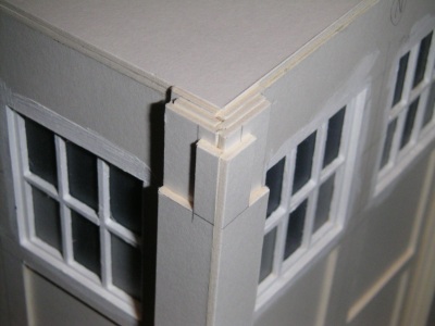
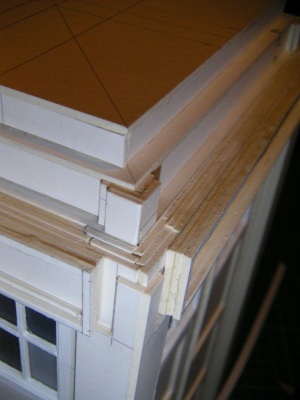
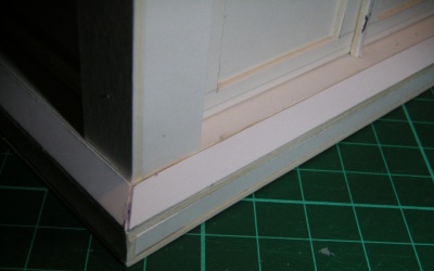
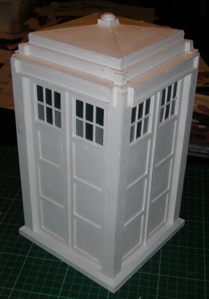
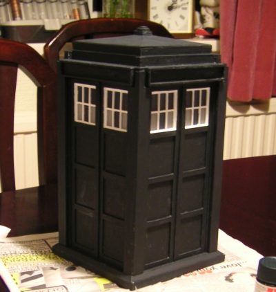
March 7th: Corner stacks done now (see Picture 4
below), and the base is completed (Picture 5)
Now for the roof.
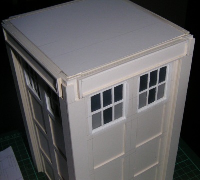
Supports are essential, because the 1.5mm card I use for the pitched roof
shows a 1.5mm edge where the roof meets the stack. That's too big
and noticeable, so I use a thinner card instead. The downside here is
that is correspondingly less rigid, and could be easily caved in. I
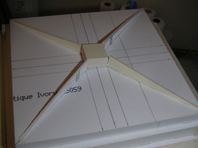
actually put 8 struts underneath spaced equally. Here's the diagonals
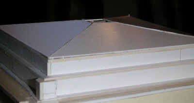
done, with a block in the middle to hold everything together, followed by the
finished roof, painted with white acrylic
primer. The primer I use is quite thick and brush-strokes leave trails in
it, which gives the surface a kind of "wood grain" effect. What a lucky
accident..
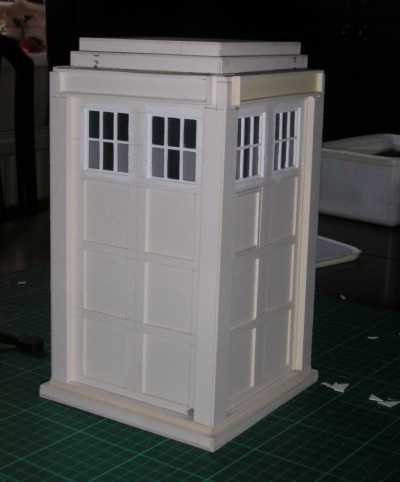
Well Picture 4
shows it with it's undercoat on. "Sea Blue" it says on the tin, but I'd be
more inclined to call it grey. It does have that kind of "Cushing" feel
though.
March 13th: It's been a
slow week, mainly because I've been trying to find some larger plastic screw
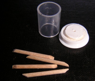
covers for the lamp cap. Here it is (Picture 5). That's the lamp cap
upside down, and the four lamp brackets - made from cut-down cocktail
sticks. They are going to be an absolute bitch to
paint.
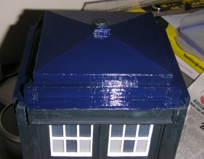
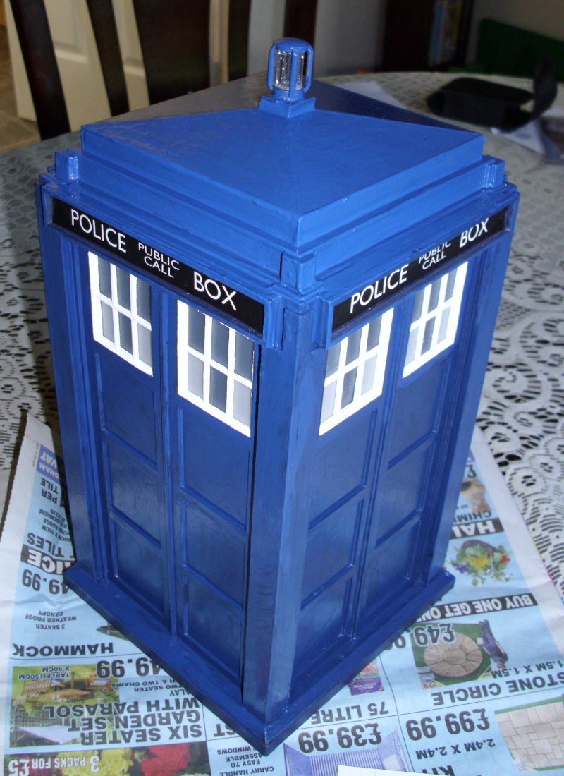
March 17th: The Blue
Paint Moment. And here's what it looks like glossed-up. A bit too
shiny, so time to get the matt varnish out.
March 20th: There's still
a bit of touching-up to do on the varnishing front, and I've had to completely
redo the lamp housing, but I've got a couple of the signs on now.
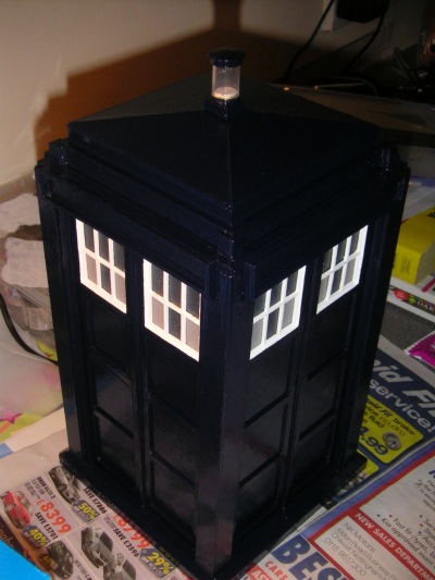
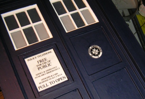
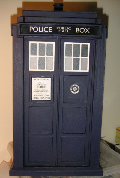
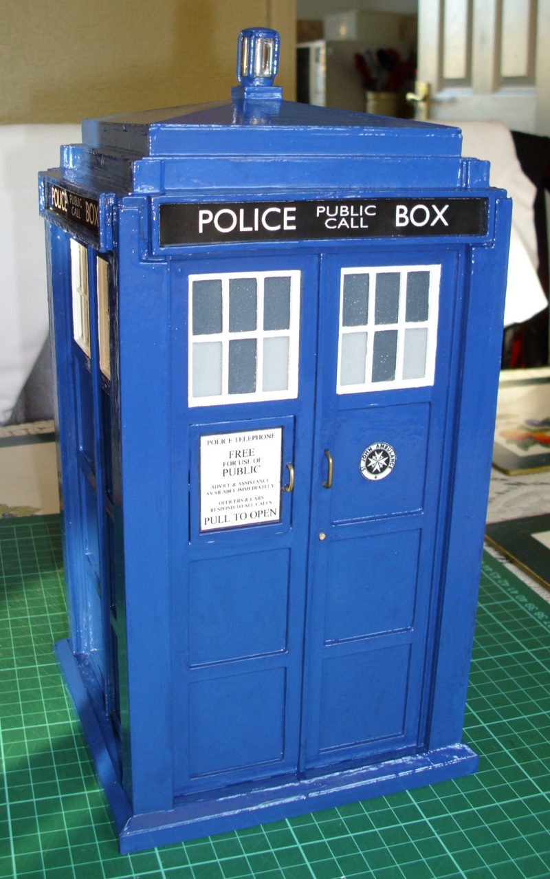
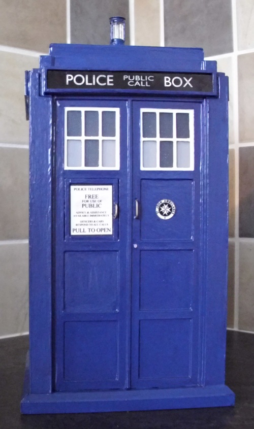
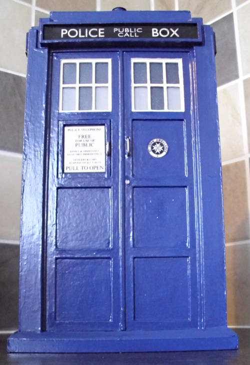
March 22nd: Finished. Not especially one
of my best. I don't like the lamp and the colour's not right.
But
then you learn from your mistakes. It'll look OK on the shelf...if I can
find a free shelf to put it on!
May 2010. We're a few weeks into the
new series of Doctor Who, and my model seems to look less and less like the
TARDIS onscreen. I've been thinking about the lamp, and I reckon I can
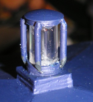
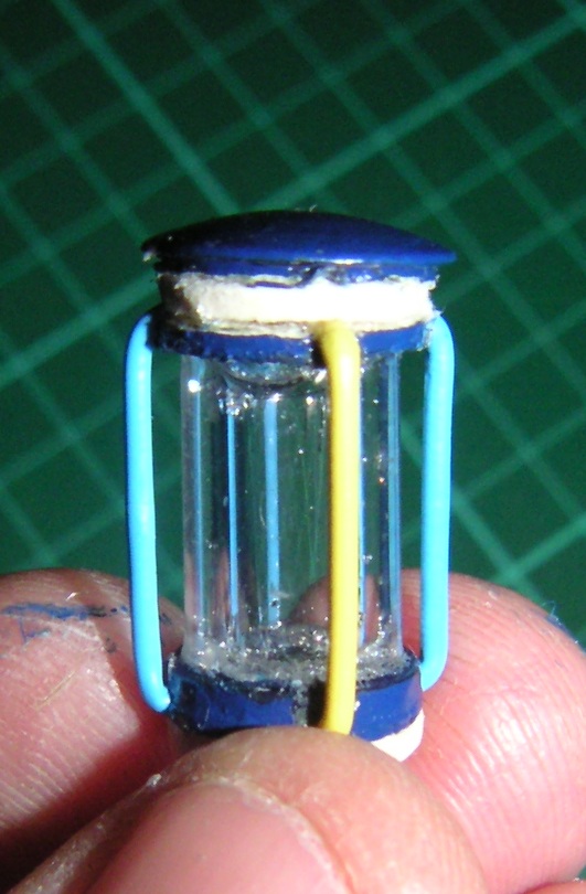
improve it. Here's the original version (Pic 1). Now I've snipped up
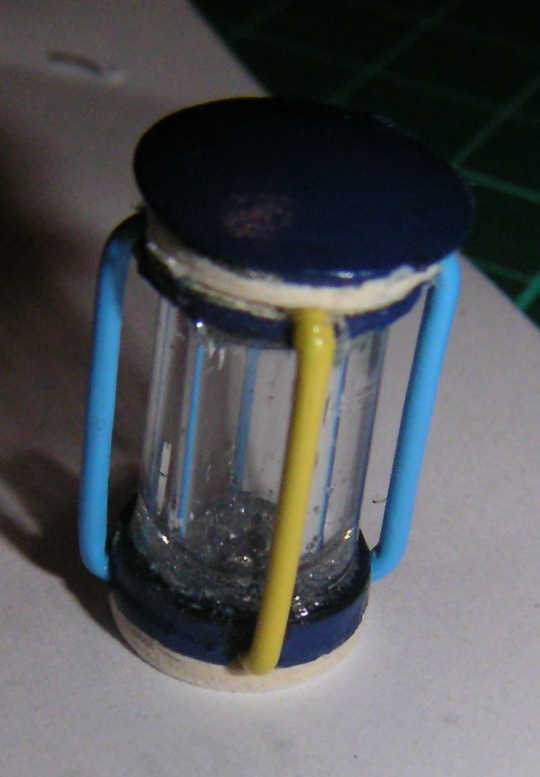
a couple of plastic coated paper clips, bent them round and glued them into the
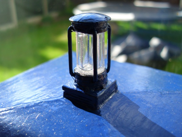
lamp housing. A few coats of paint, and I think this looks a bit
better.
But
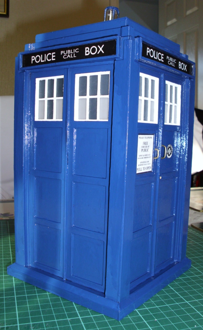
I'm still not happy about the overall colour. Matt Smith's TARDIS is a
lighter blue. This one looks like Tennant's. So I get another shade
of blue - unfortunately only in gloss, so although the colour is better, it now
looks like a cookie tin.
So once more I cover a gloss finish
with matt varnish. That's more like it.

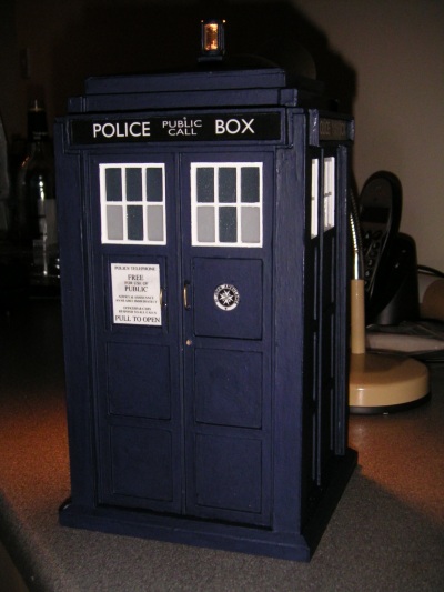
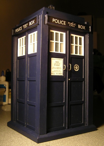
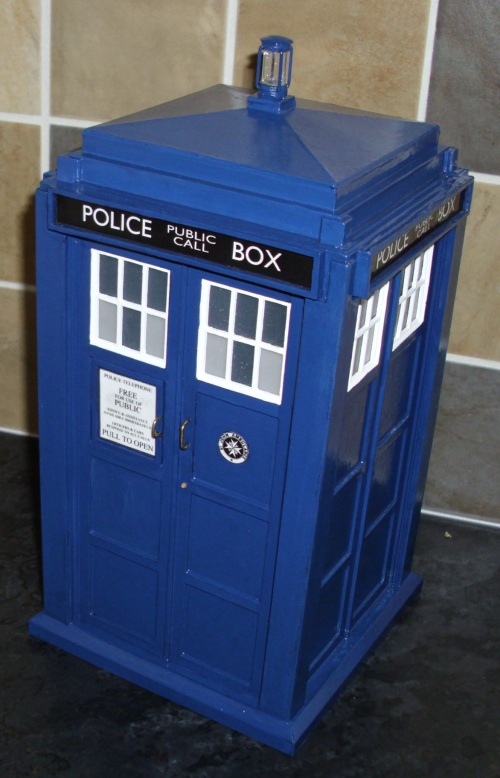
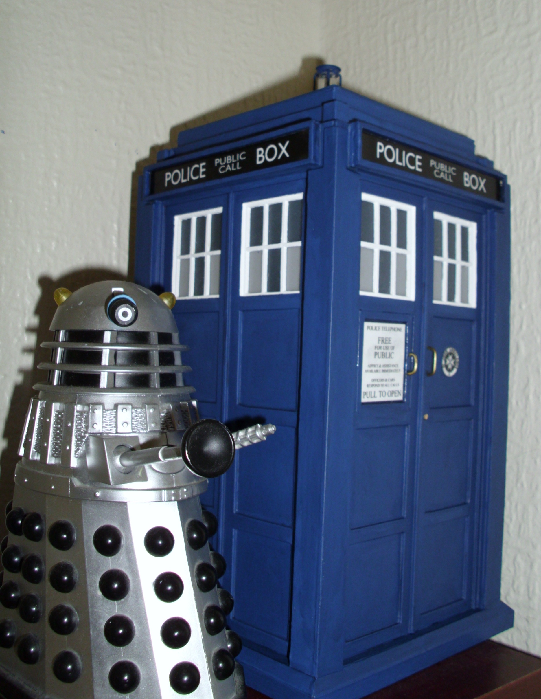
June 2010, ironically just after the
new series has finished, I finally consider the model finished as
well!
This Web Page Created
with PageBreeze Free HTML Editor